

Welcome to the world of data visualization, where complex data becomes accessible, understandable, and even compelling. Whether you're a student, a business professional, or just a curious individual, learning how to visualize data can significantly enhance your analytical and storytelling skills. Here's a beginner's guide to get you started.
Understanding Data Visualization
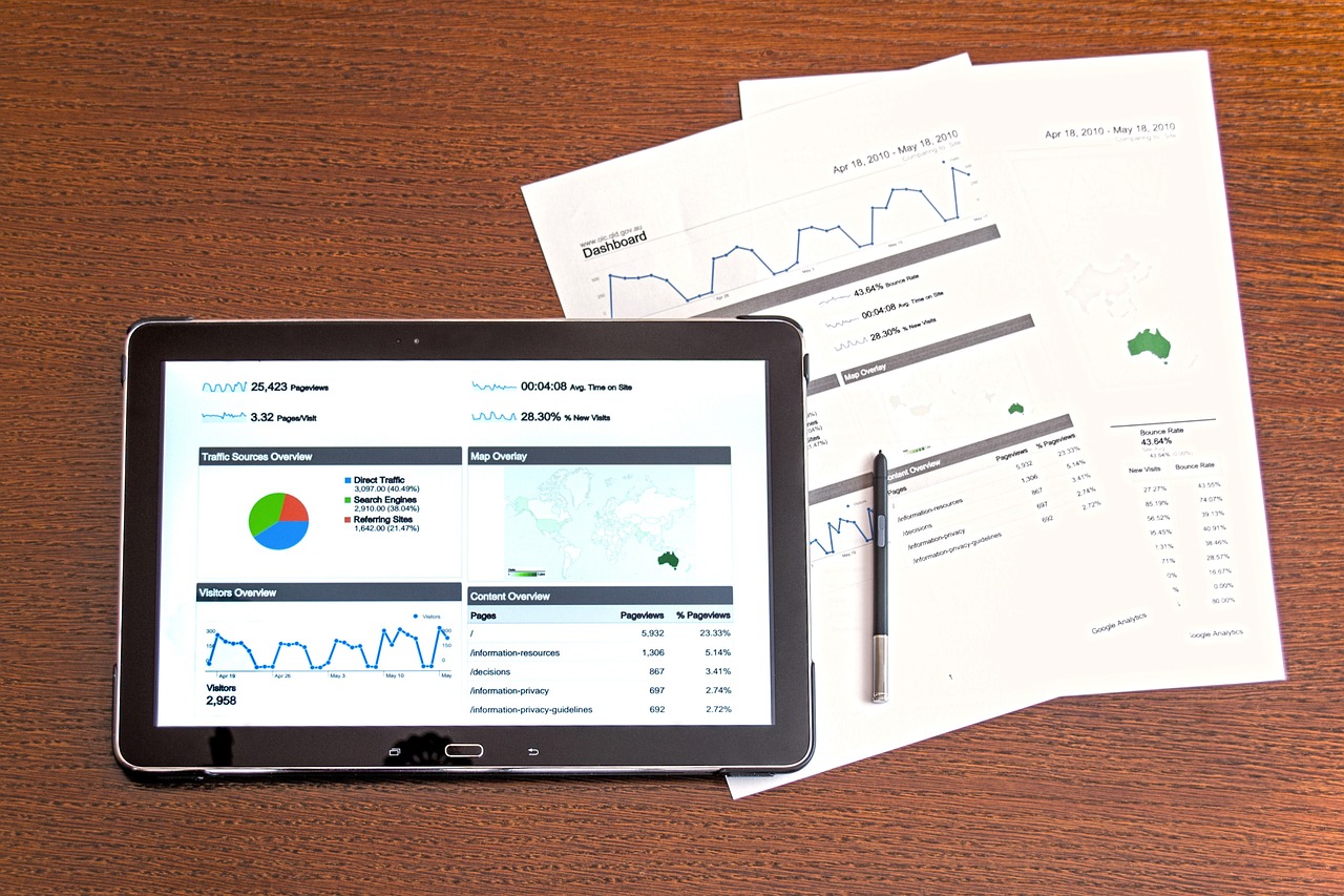
Data visualization is the graphical representation of information and data. By using visual elements like charts, graphs, and maps, data visualization tools provide an accessible way to see and understand trends, outliers, and patterns in data.
Why is Data Visualization Important?
- Clarity and Efficiency: It helps to quickly interpret and make sense of complex data.
- Identifying Patterns: Patterns, trends, and correlations that might go undetected in text-based data can be exposed and recognized easier with data visualization.
- Storytelling: It's an effective way to tell stories with data, making the information more appealing and understandable to a broader audience.
Getting Started with Data Visualization
1. Learn the Basics
Understand Data Types: Get familiar with different types of data: nominal, ordinal, interval, and ratio.
Choose the Right Chart Type: Learn when to use different types of charts and graphs, like bar charts,
line graphs, pie charts, scatter plots, etc.
2. Tools and Software
Start with Excel or Google Sheets: These basic tools are great for beginners to create simple charts
and graphs.
Explore Advanced Tools: As you progress, explore tools like Tableau, Power BI, or open-source options
like D3.js for web-based visualizations.
3. Practice with Real Data
Public Datasets: Websites like Kaggle or Google Dataset Search offer a variety of datasets for practice.
Personal Projects: Use data from your hobbies or interests to create visualizations.
4. Understand Good Design Practices
Simplicity is Key: Avoid clutter and focus on presenting data in a clear, concise way. Use Colors Effectively: Learn how color schemes can enhance or detract from your data visualization. Label Clearly: Ensure that your charts include clear titles, axis labels, and legends when necessary.
5. Learn to Tell a Story
Narrative Structure: Structure your visualization like a story with a beginning, middle, and end. Contextualize Your Data: Provide background and explain why the data matters.
6. Feedback and Iteration
Seek Feedback: Share your visualizations with others to get feedback. Iterate and Improve: Use feedback to refine and improve your visualizations.
7. Stay Curious and Keep Learning
Follow Experts: Follow data visualization experts on social media or blogs. Stay Updated: Keep up with the latest trends and tools in data visualization.
Starting with data visualization can be both exciting and daunting. Remember, the journey is as important as the destination. As you get more comfortable with the basics, challenge yourself with more complex datasets and tools. The ability to effectively visualize data is a powerful skill in today’s data-driven world, and your journey in mastering it starts now.
Happy visualizing!